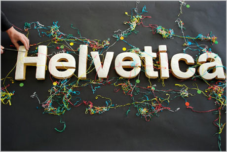
(You know you're in trouble now, don't ya?)
But no, I am not a trained typologist.
I only just learned the difference between a serif and a sans-serif font. (serifs!)
But regardless, I intend now to speak to you about a scourge sweeping the world or words. And that scourge is:

Helvetica.
I hate this font. But let me tell you why.
It isn't enough that it is used by thousands upon thousands of brand-names.
It would only be typical then, that it would be selected as the official font of such a hallmarks like Apple, infecting not only the logos, but the actual text of my email and text messages.
But that isn't enough.
It is also used OFFICIALLY, for the font of the MTA and Chicago Transit.
So everyday that I rode the train home in New York, I didn't just ride the 2, 3 to 135th street, I rode it to:
Consider myself branded.
This is the font of brands. It is perpetuated by brands. Unlike Arial, a very similar font that gained popularity by being a computer default in countless programs such as Microsoft Word, the only standard Helvetica has assumed is that of the brand: the clean, direct lines which design loves, the evened, paced weight, the proportional spacing, and the lack of any sort of hand-writing appearing calligraphy styling.
It is cold, proportional, and machinic. It is totally modern. It is simple. Different. Apple.
You see? I didn't even mean to do that, but I slipped into design-brain-fuck-land, just by thinking in Helvetica! I dreamed that the entire world was proportional, and my interface was entirely clean and smooth, and every person wore black jeans and black mock-turtle necks. Most importantly, we all only spoke in informative slogans, and nothing was wasted. All of us sans-serif enuchs were perfectly happy, because we had been designed to be so. No third-party OS, no viruses, no pulse. Simply: Bliss.

I don't mean to pick on Apple, but they are certainly one of the most-recognizable users of Helvetica, and for the same reason that they design products with slim form factors: it is recognizable and clean, and sticks in the mind like an icepick covered in wall-paper glue.
But enough of this effluviac outbursts at the users of a mere font. Perhaps I should talk more about the font itself.
It was designed in 1957 by the Swiss--at the height of the fame of Swiss design and graphic arts.
According to Wikipedia, a goal of the typeface was: " to create a neutral typeface that had great clarity, had no intrinsic meaning in its form."
This is pure modernism in its most commercial state: form is function, right? No form other than the meaning it intends to transmit. It is pure, unassuming, and liquid. A bright, shining, blue-eyed Jesus of fonts. A white dove. Concrete. White plastic.
But isn't this a form in itself? A metaphysical attempt to reach the design-centric esoteric knowledge of pure performance... it is a product so useful we cannot help but buy at least one or two. Give them as gifts. Decorate with them. They are objet-de-arte, a paper-clip so beautiful we buy them just to place on the desk. We put them in museums, because we admire something so useful. In fact, we would never dare scratch it surface with actual use--that is to say for a font, actual content--because it would dirty the purity of the form which we so admire: no form at all.
This is sounding familiar. A form so ideal as to take on the qualities of form itself... an object so perfectly useful as to defy any actual use... a commercial unit that defines the goals of commercialism perfectly.
A Commodity.
 Leave it to the Swiss to turn phonemes into commodities of exchange. Leave it to the Americans to buy into a commodity with everything they've got, putting the whole corporation on the back of its cleanly designed weight.
I won't push the comparison too far; I respect the philosophy behind exchange commodities too much to act as if Helvetica actually has bearing on the linguistic economy as great as the monetary system.
But at the same time, the similarity is uncanny--and deliciously so. The idea that a typeface could be designed without form! As if it was pure transaction of linguistic value! As if there was no aesthetic surplus value added by the appropriation of a certain type by so many major corporations and institutions; as if they were not telling us something with this form; as if the casting of logos into typographical symbols was not itself a massive trick of design! Which is more recognizable: the Apple logo, or the word "iPod" written in Helvetica? You might recognize the apple, but you are forced to read "iPod" over and over again by the mere naturalness of written communication. By developing a non-destracting design which feeds into the eye's sense of proportional weight, they are almost forcing us to speak their product name outloud, every time we use our eyes.
 Well, maybe it is not as drastic as all that, but if you believe in any fundamental principles of aesthetics and design, it isn't too far off.
What they've done is developed a brand for modern commercialism, a brand for branding, and the representative product of brand is Helvetica: the type without form, and only function. No goal but the propagation of product. No exchange but more exchange. No value except that for which it can be exchanged.
John Carpenter should have definitely used Helvetica for the font of the brainwashing signs in They Live. His font is a little too 1940s, a little too bold. Perhaps he was thinking of Fascism more than the commercialism of the post-war period.
Far be it from me to call Helvetica a fascist font--or even a capitalistic font at that. It's only a damn typeface.
But, I think the link between its intended design, its use, and its subsequent popularity are quite interesting. Helvetica will be a signpost of our times. It is a symbol of late Capitalism, by way of being a symbolic type par excellance. And as such, it is ugly, and dispicable. It is the metaphysical grapheme of consumerism, and I hope it dies along with it.
...but then again there is this:
"Helvetica is a relatively contemporary typeface, protected by Trademark owned by Linotype, that was designed in 1957 by Max Miedinger for the Haas Type Foundry in Switzerland. However, there existed an earlier typeface that was designed and put into use by Joseph Goebbels for the German Socialist Party and it is Goebbels' type design that is regarded as being the forerunner of what was later the derivative typeface (re)designed by Miedinger and named as Helvetica.
There have been a few books written about Helvetica recently from contemporary perspectives and although well written, they revise the history involved. Reading a few, I see an effort to both apologize for a past creative work effort and to deny that it occured and for contemporary, political reasons. However, in Literary Theory, there is an understanding of arts apart from troublesome political pasts, creative works as now having been "cleansed" in the conceptual and theoretical and thereby considered on their creative merits without association with offensive political characteristics. Helvetica is a work of art that has been "cleansed" in this regard and it is a disservice to try to rewrite the history of the art involved out of fear for the climate in which the art was created; and, using the art or making reference to it does not thereby imply nor make reference to the now-removed, offensive originating circumstances -- not in the case of this typeface nor in the case of other, similarly considered creative works."
Ahh! Fascist fonts!


No comments:
Post a Comment